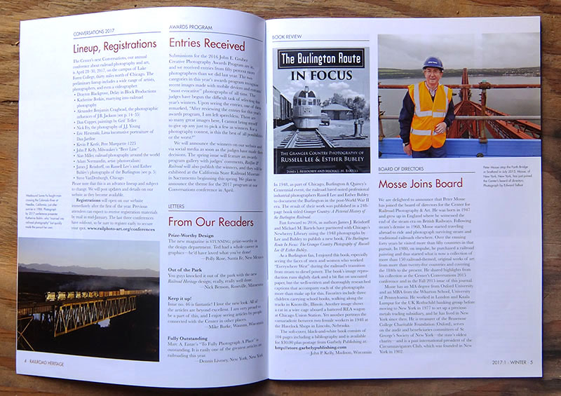
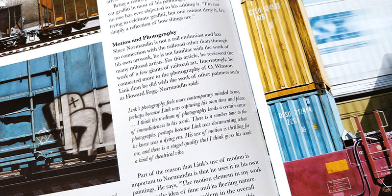
A complete graphic overhaul of a decade-old quarterly publication, this collaboration with designer Alex Craghead lead to an improved presentation of visual materials, as well as a radical rebranding that achieved a modern yet timeless look. Key achievements include a significant increase of average image size, restful negative space, and total word count without resorting to smaller fonts, along with an increased cohesiveness through strong but flexible compositional rules.
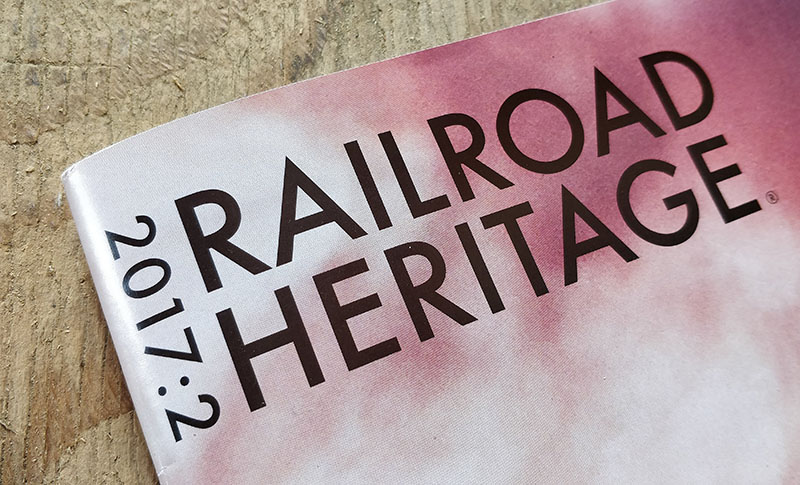
Foreseen as a decade-plus publication redesign with significant brand impacts for the parent institution, great care was exercised to imbue the right note of personality. Typeface choices revolve around timeless serif body text, while show fonts and masthead logotype are rendered in Futura, a modern typeface frequently used by railroads and transportation companies in the 20th century. Logotype also includes a concise, bold date display meant to improve browsability for a saddle-stitched publication.


